


ReelTown Slots Store Revamp
Overhauling the store of ReelTown Slots: competitor research, rounds of wireframes that brought a whole team to one design, and a purchase flow built around the moment a player gets what they paid for.
- Company
- Big Fish Games
- Role
- UX Designer, wireframes and usability
- Team
- Product team and stakeholders
- Platforms
- iOS and Android
The brief
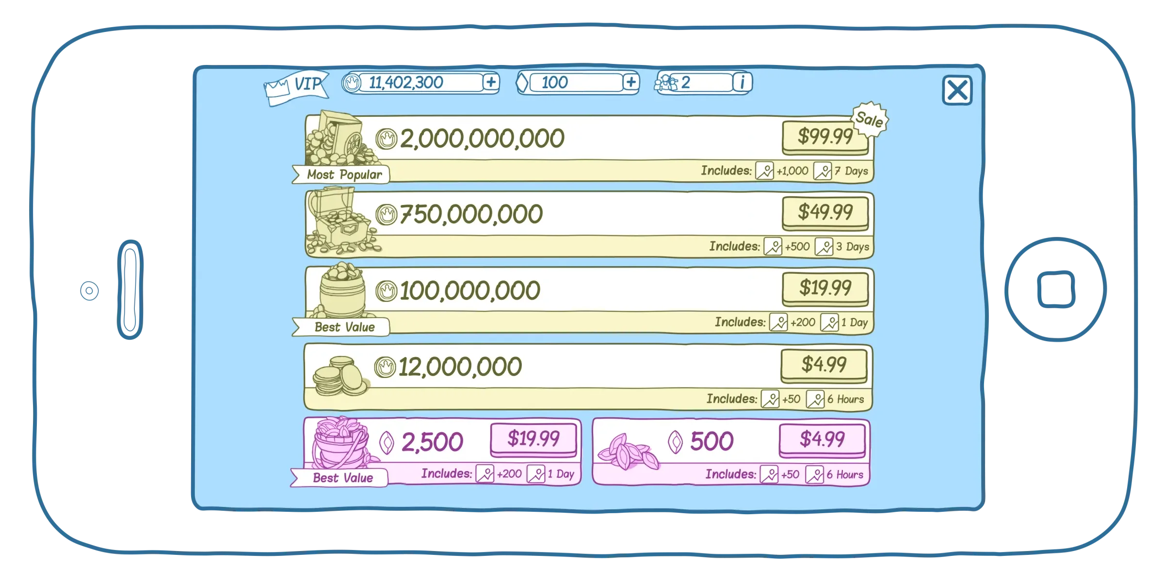
I was brought onto the ReelTown Slots team to improve the app's usability, starting with the store. The goals were to increase conversion, improve legibility and the visual priority of the UI, explain the boost and VIP systems more clearly, and make buying feel clear and rewarding.
To comply with my non-disclosure agreement, I have omitted and obfuscated confidential information in this case study. All information in this case study is my own and does not necessarily reflect the views of Big Fish.
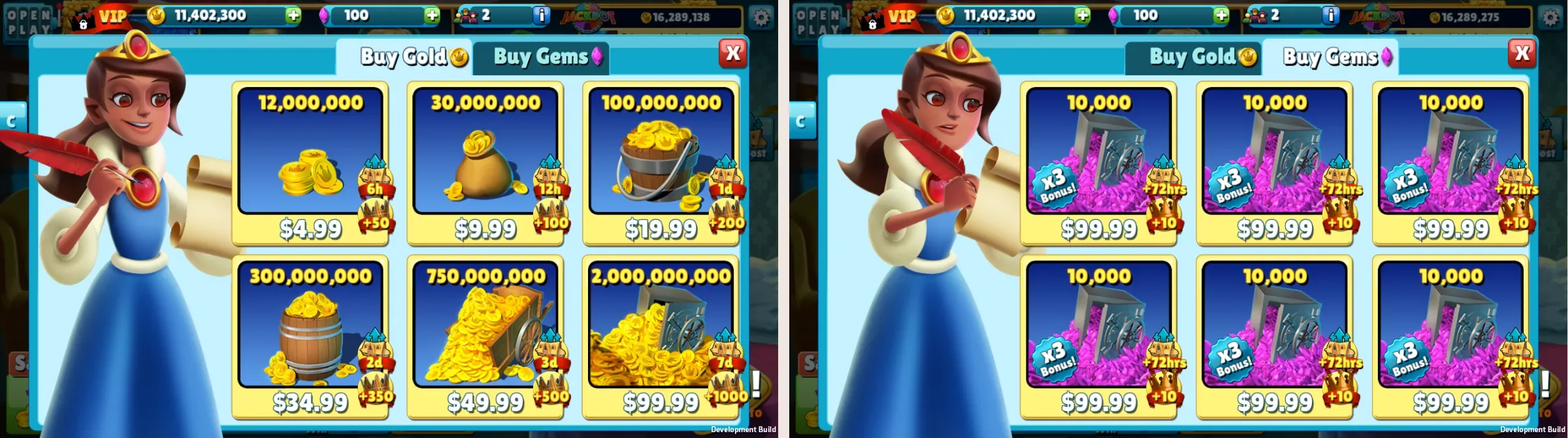
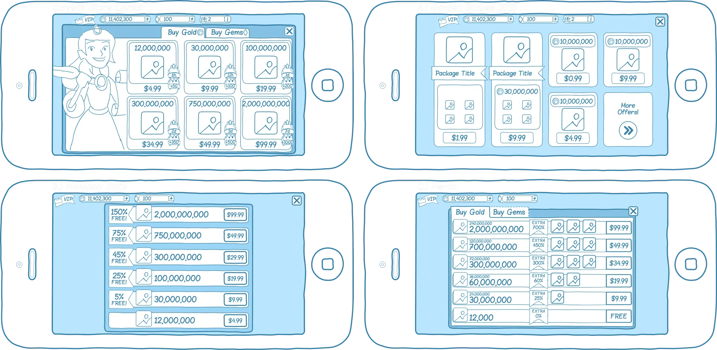
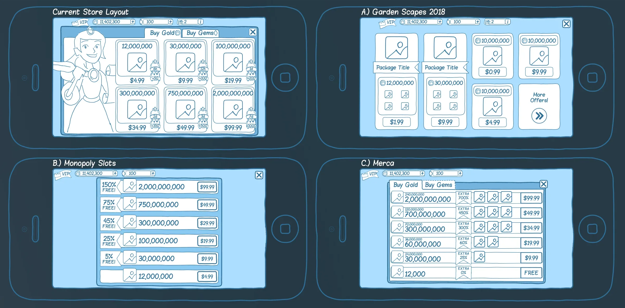
The previous store, before the redesign.
Competitor analysis
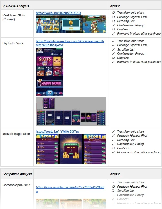
I started by learning what players in this niche had come to expect. I screen-recorded myself making small purchases in every app with real market share in our space, added each video to a shared spec, and compared every store on the same questions:
- Does the store have animated transitions?
- Does it show the highest package first?
- Are packages in a scrolling list?
- Is there a confirmation after purchase?
- Are there doobers (flying coins) that show the player they've been credited?
- Does the player stay in the store after buying?
None of these is good or bad on its own, but together they gave us a clear record of the space before we committed to any decision.
Iteration and exploration
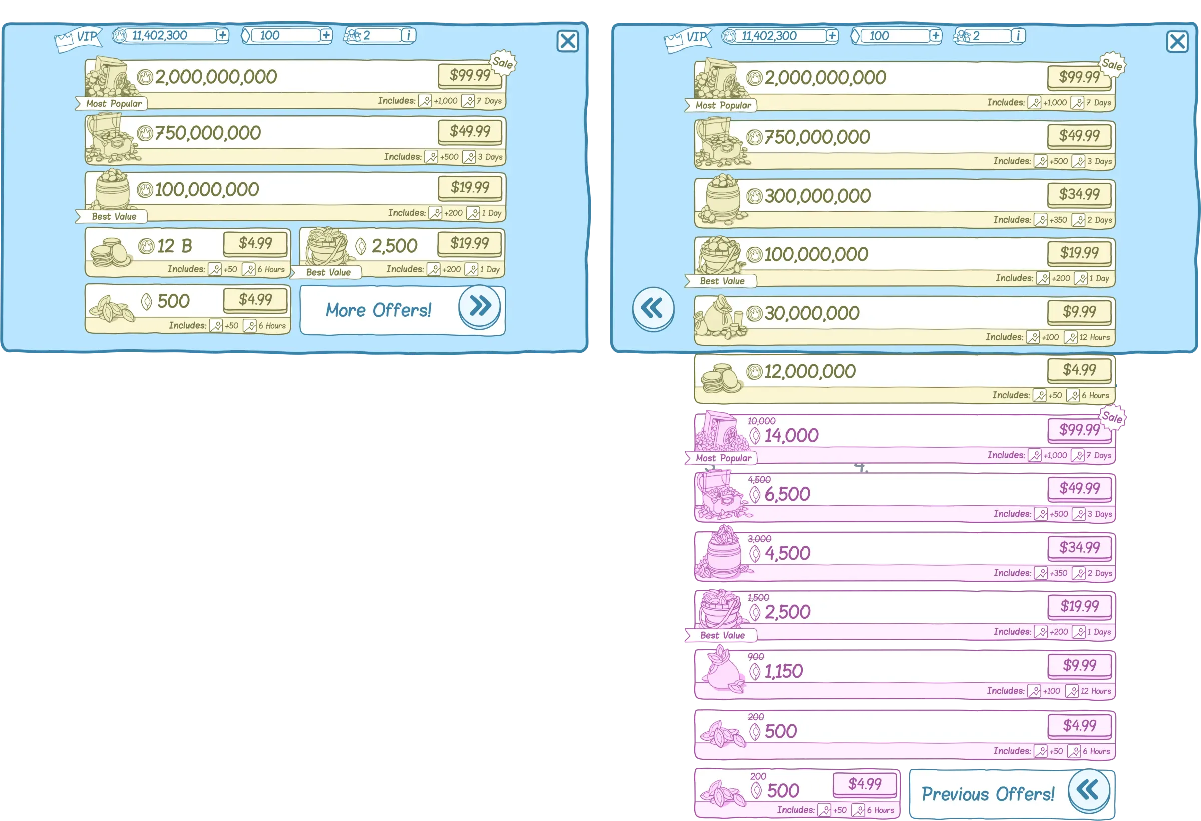
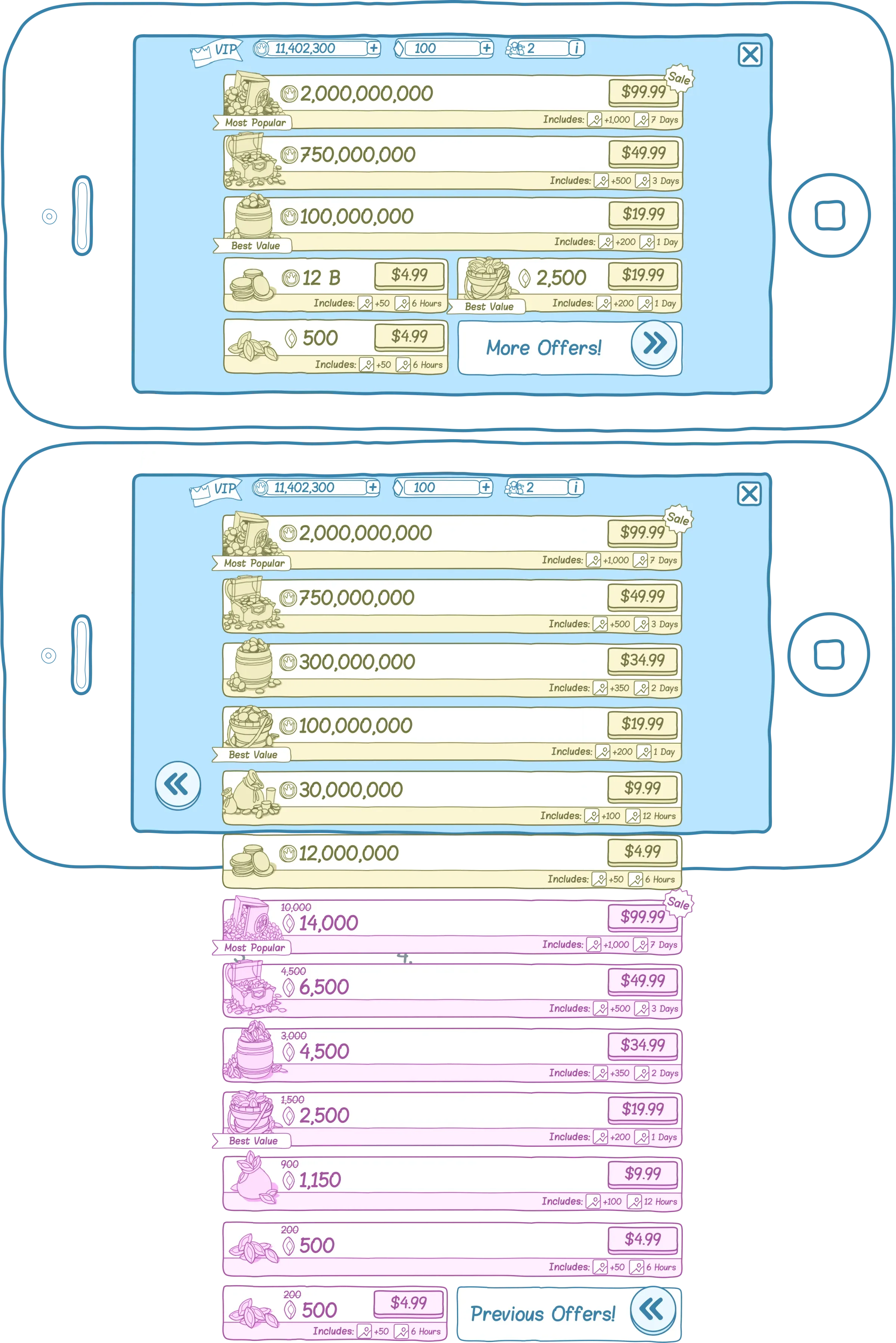
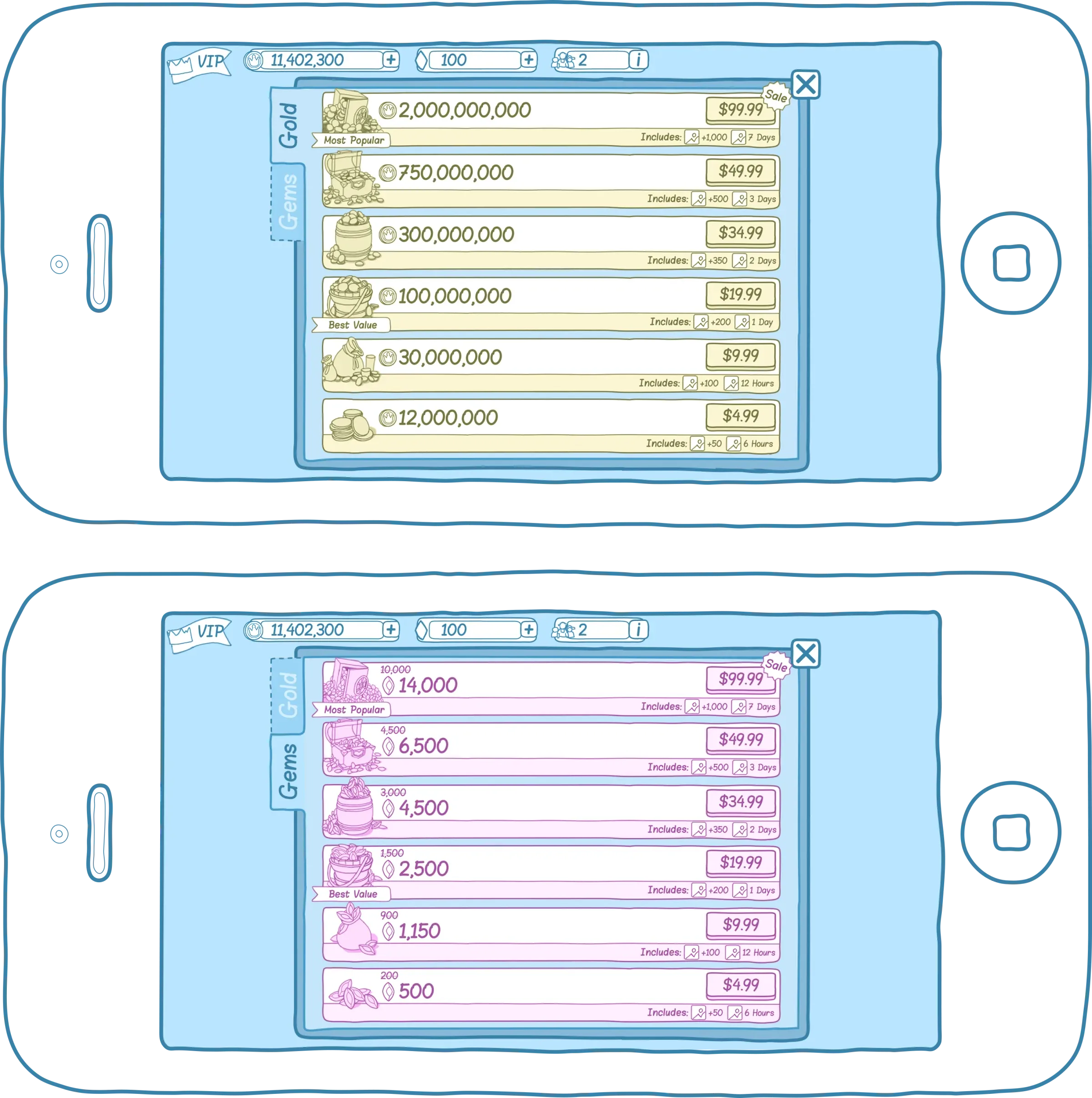
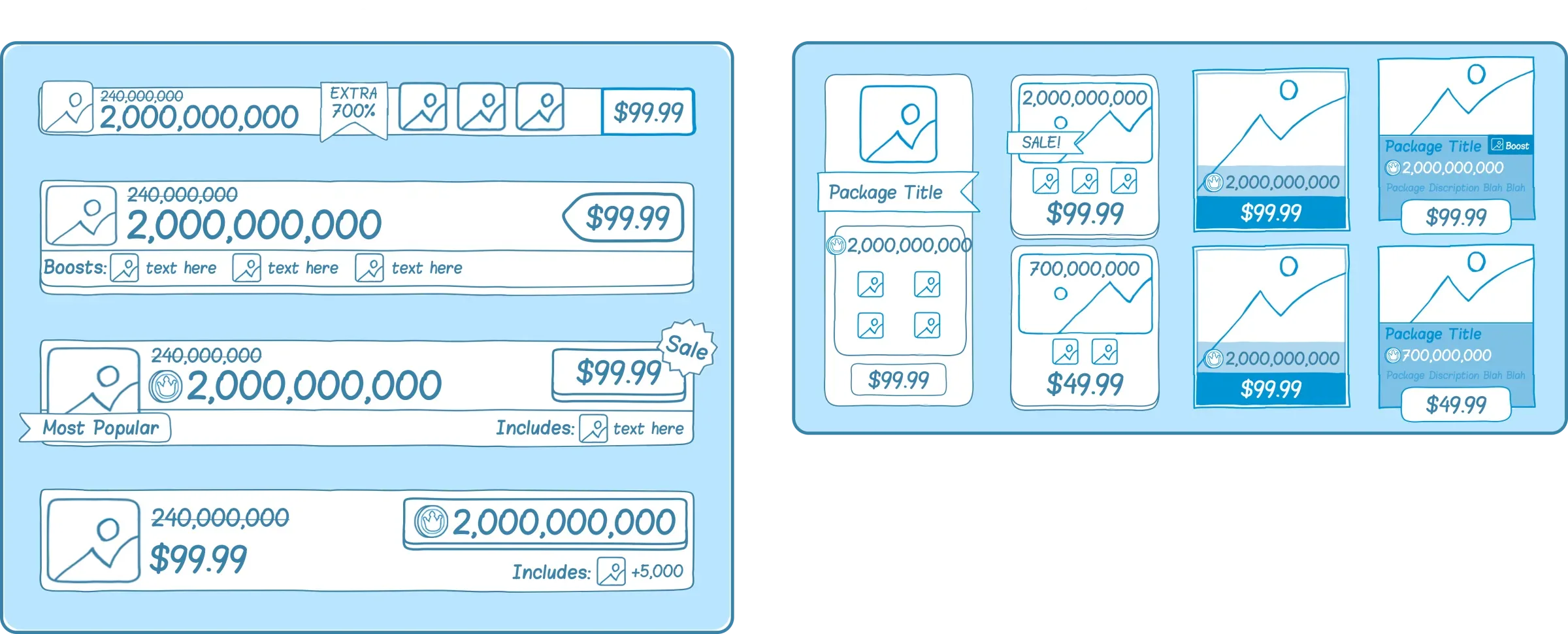
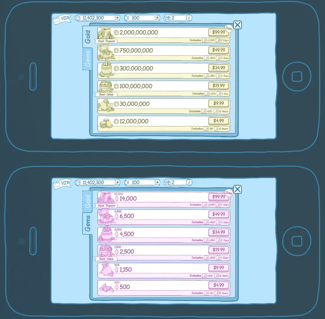
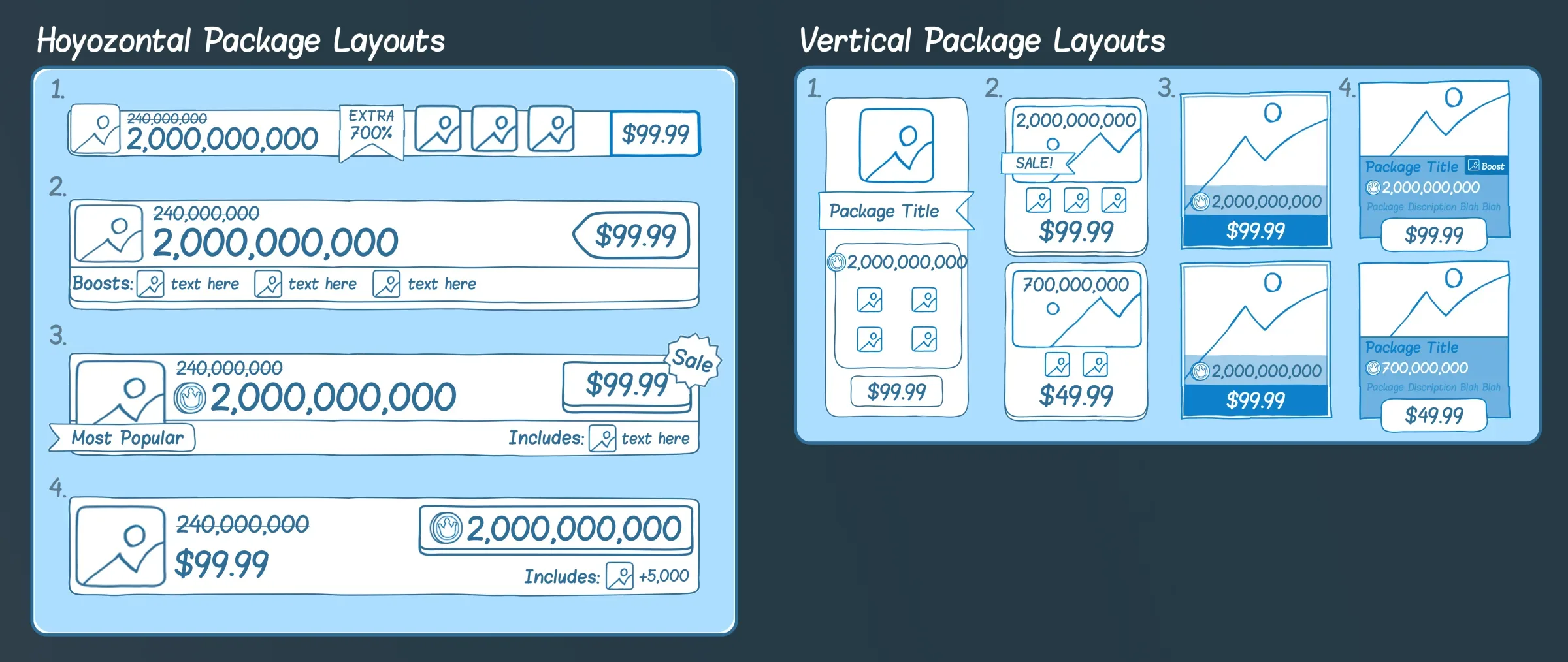
Next I iterated on layouts. The brief was to stay away from visuals, so I worked in simple wireframes and focused on layout, visual priority and usability. This early stage is my favorite part of a project. With each round I narrowed in on what the decision makers wanted and what worked for the development team, while keeping players' needs first. Starting with the big problems and working down to the pixel-level ones, we arrived at a design the whole team was happy with.
Stakeholders sometimes join late and ask why decisions were made, which can send a project back around in circles. So I save a new version of my working file at every major decision, so we can always jump back and see what we decided and why.
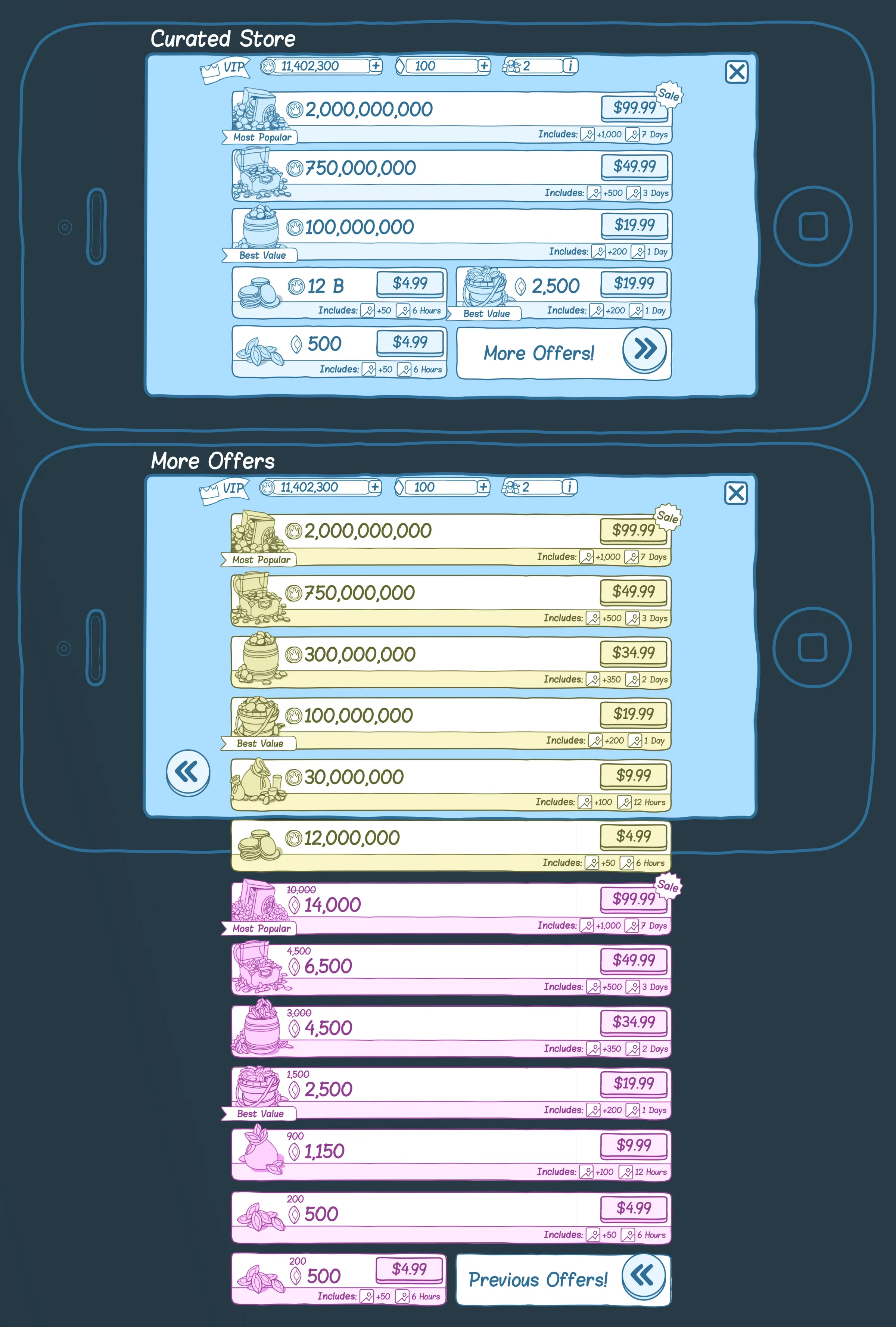
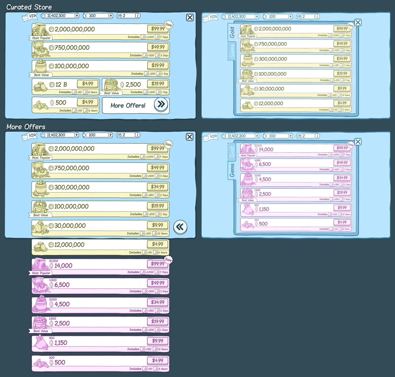
Final layout
The layout we settled on in the final round.
The purchase flow
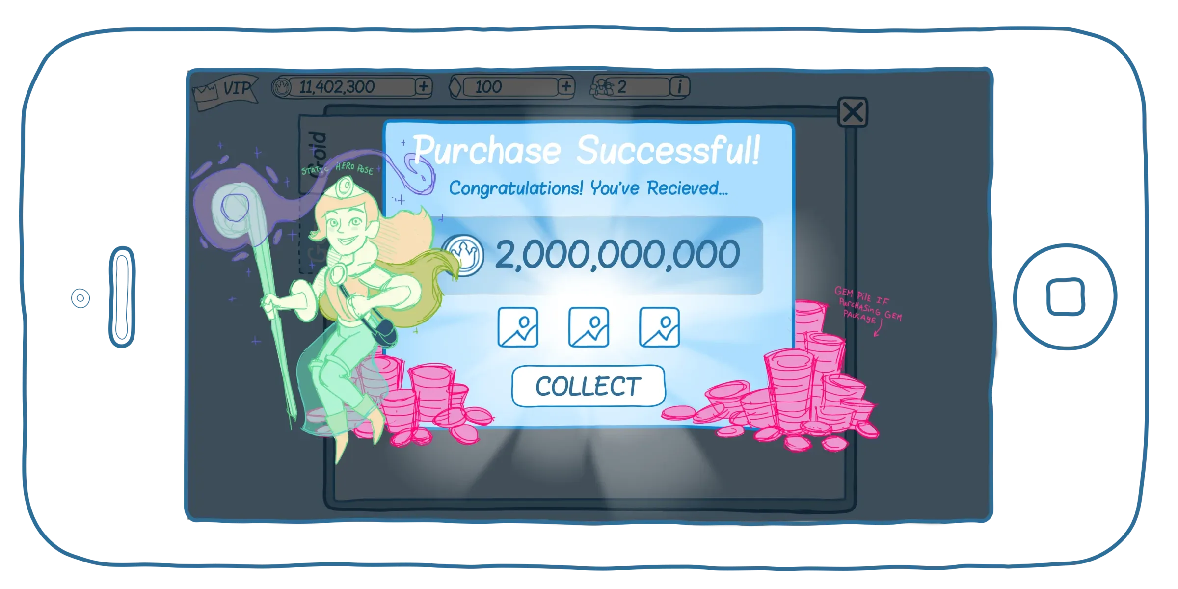
The most important part of a store is how buying feels. My competitor research set the minimum bar, and everything above it was a chance to delight. The key is the moment a player sees they've received what they bought: it should be exciting enough to feel like a real reward.
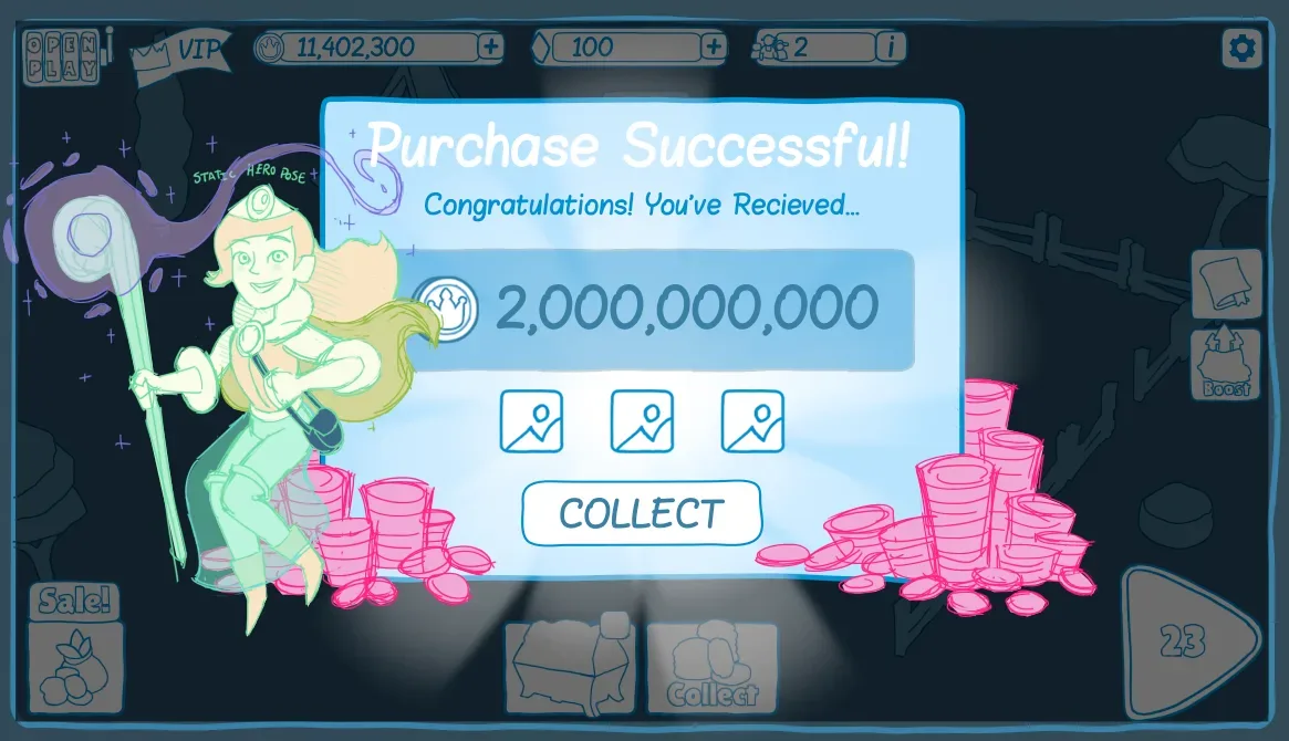
This still was a placeholder for the illustrator to build from, with a particle effect planned for the character's staff. The particles, the animation choreography, the doobers and the big bold text all add up to a good experience for players spending their hard-earned money on virtual currency.