


Pokémon TV
Problem
In March of 2021, young Pokémon fans could exclusively access Pokémon TV (PTV) via web; the streaming service needed to be ported to the Nintendo Switch™ to increase accessibility for its most important audience. TPCI created this streaming service with the intent of influencing sales of Pokémon Trading Cards - making the bold choice to exclude monetization. The streaming service needed to be easy for young viewers to navigate while offering a vast library of Pokémon’s entertainment content.
Goals
-
Influence sales of Pokémon Trading Cards
-
Port PTV to Nintendo Switch™
-
Drive new Pokémon viewers to the platform to achieve 7.2M average monthly USA views in 2021
-
Expand the total reach of Pokémon’s home entertainment
-
Increase customer lifetime value (LTV) while growing brand loyalty
-
Create a polished experience that is fun and sparks user delight
To comply with my non-disclosure agreement, I have omitted and obfuscated confidential information in this case study. All information in this case study is my own and does not necessarily reflect the views of TPCI.
Process
Conducted a competitive analysis, identified key personas, and considered customer feedback and product metrics to create informed user centered designs
Used the previously built web product as the basis for porting to the Nintendo Switch™ in order to mock up platform specific solutions and wireframes
Gained approval and buy-in from stakeholders as I iterated on the designs for PTV on Nintendo Switch™
Worked as a member of an R&D team, in close collaboration with engineering, to rapidly prototype my approved designs in the Unity game engine
Created an interactive prototype in Unity, localized into eight languages, and conducted internal user research to inform usability findings
Maintained detailed user interface specifications
Owned documentation and final production of all designs and assets


This is a recording of a test of the project running in Unity
Personas
Kids

Age: 4- 12
Market Share: 45%
Description: Kids present the largest opportunity for the brand as they influence their parents to purchase Pokémon cards, games, and toys; they have the highest potential customer LTV.
Millennials

Age: 25-40
Market Share: 15%
Description: Adults with disposable income and no children who grew up loving Pokémon will engage with the original animated series and potentially purchase cards, games, and toys.
Millennial Parents

Age: 25-40
Market Share: 25%
Description: Parents hold the purchasing power, while children influence those purchases. The parents pass down their love of Pokémon to their children in a cyclical relationship creating a bond over the brand.
TCG Players

Age: 6-45
Market Share: 15%
Description: TCG players can access on-demand videos of card matches while remaining immersed in the Pokémon ecosystem. This influences players to purchase and play the physical cards.
I conducted an in-depth competitive analysis of the top streaming services available on the Nintendo Switch™. This helped me gain a deeper understanding of user expectations, where competitors excel, and what competitors do poorly. It also helped me make informed decisions and gain buy-in when speaking with stakeholders.
Competitive Analysis


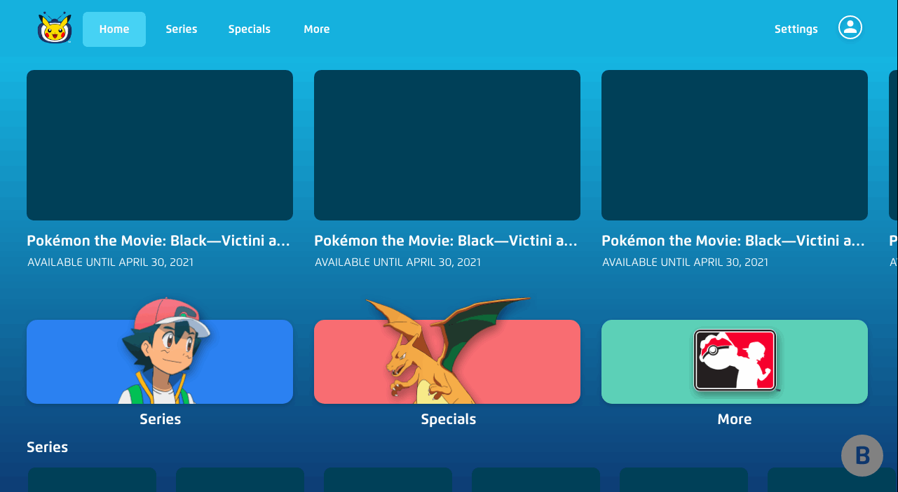
Wireframes
I utilized the findings of the competitive analysis to brainstorm ideas for the potential layout and UX of PTV’s Nintendo Switch™ port. I produced several iterations of potential designs and presented them to key stakeholders until we identified the best layouts from which to create a playable prototype.
The wireframing process of this project called for fewer iterations and less exploration due to the desire for the Nintendo Switch™ app to be cohesive with the web product that already existed at the time. The colors, fonts, and branding were all meant to be inspired by the web product. The mock ups I did were meant to explore the best possible way for users to discover and view video content on the Nintendo Switch™ platform while taking controller support and touchscreen functionality into account.
Interactive Prototype
This is an interactive prototype was used as a proof of concept to gain approval on the UX flow before we started building in the Unity engine.
Building for Nintendo Switch™
-
After a lot of setup and trial and error, we finally got the app to run on the Nintendo Switch™ dev kit.
-
Learning to push builds to a Nintendo Switch™ device with a licensed developer kit was a massive life goal achieved.
-
UI implementation was easier in some ways because the Nintendo Switch™ has a fixed screen resolution, so there was no need to consider responsive UI scaling.
-
This port offered vast learning experiences in regards to building the UX for controller support and touchscreen interactions.
-
Once completed I became the resident Nintendo Switch™ expert on my team at TPCI.

Final Shippable Product


Customer LTV in Action
Outcomes
+33.5%
Monthly active users