Big Fish Casino Store Revamp
Problem
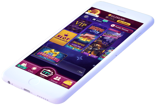
Big Fish Casino is a top-30 highest grossing social casino mobile app. Despite the apps success, its age had begun to show. Customer feedback revealed that the store was confusing and created a hurdle for people who wanted to purchase. The feature needed to be tailored to an older audience in order to drive purchases and increase revenue.
How might we make purchasing chips/ gold in big fish casino easier?
Goals
-
Increase bookings and conversion rate
-
Bring a modern look and feel to make the store more reputable
-
Allow users to clearly understand the store logic
-
Promote sale multipliers, VIP multipliers, and the resulting total multiplier
-
Create a polished result that is fun and sparks user delight
To comply with my non-disclosure agreement, I have omitted and obfuscated confidential information in this case study. All information in this case study is my own and does not necessarily reflect the views of Big Fish.


Conducted a competitive analysis and considered customer feedback and product metrics to create informed user centered designs.
Collaborated with product managers and engineers in order to implement cross-platform user interfaces and experiences on a re-designed coin store.
Created an interactive prototype and conducted in-person user research to inform usability findings.
Maintained detailed user interface specifications.
Owned documentation and final production of all designs and assets.
Process

Next, I conducted an in depth competitive analysis of the top grossing competitors, including those outside of the casino space, to evaluate what they do well and what they do poorly. This also helped me build a case for my decision making and gain buy-in when speaking with stakeholders.
Competitive Analysis

Iterative Process
I utilized the findings of the competitive analysis to brainstorm ideas for the new store's potential layout and flow. I produced many iterations of potential designs and presented them to key stakeholders until we identified the best layouts from which to create playable prototypes.
Video capture from the user testing sessions (left video). Video of playable prototype I made in principle (right video)
User Research/ Usability findings
Next, I built an interactive prototype. We used this to conduct direct interviews with users at our research lab in Seattle in order to understand what they prioritize when purchasing. The majority of our users were pleased with the updated store thus far.

More Iterations
I utilized user play-test feedback to inform several iterations of the store’s UI/UX that were tailored to the players’ needs.

Engineering Costing
Once the store design was nearing final approval, it was brought to the engineering team to conduct a cost analysis to ensure that creating the design wasn’t too expensive to build.

Launch
This product was released in phases. Only a portion of users saw the initial release of the new store. Once the major bugs were fixed, the updated store launched worldwide.
Production Phase
Production tasks were delegated among the Art Team. This includes specialty tasks like effects animation, art asset production, etc.

Post-launch Maintenance
After the feature was launched, we continued to gather data on the successes and failures of the feature so that we could continue to boost revenue and improve the experience for the players.
Outcomes
+38.4%
Increase in sales
The new sleek, intuitive design presented information to the users concisely, making purchasing chips easier and more delightful than ever; this ultimately resulted in an increase to the company’s bottom line and a decrease in customer service tickets. When the modern store design launched it was well received by our users, generated 38.4% more revenue than the previous store design, and taught me a lot about user centered design principles.
Production Kickoff
Production tasks were distributed to the art team. This included specialty tasks, such as effects animation, art asset production, and more. I worked closely with the marketing team, effects animators, and illustrators to ensure that the product was visually polished and delivered on time.