


Big Fish Casino Store Revamp
Redesigning the store of Big Fish Casino, a top-30 grossing social casino app, to make buying chips clearer and more rewarding. The new store brought in 38.4% more revenue than the old one.
- Company
- Big Fish Games
- Role
- UX/UI Designer, research through production
- Team
- Product managers, engineering, art, effects animation, marketing
- Platforms
- iOS and Android
- +38.4%sales over the previous store
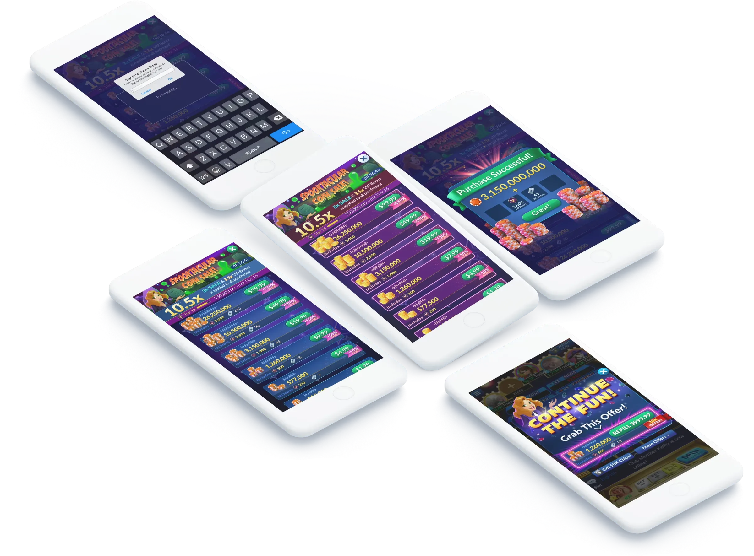
The problem
Big Fish Casino is a top-30 grossing social casino mobile app. Despite its success, it had started to show its age. Customer feedback said the store was confusing, which put a hurdle in front of people who wanted to buy. The store needed to be designed for an older audience, to drive purchases and increase revenue.
How might we make buying chips and gold in Big Fish Casino easier?
Goals
- Increase bookings and conversion rate
- Bring a modern look and feel that makes the store more trustworthy
- Make the store's logic easy to understand
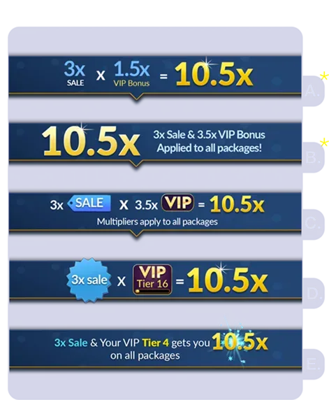
- Promote sale multipliers, VIP multipliers and the total multiplier they add up to
- Create a polished result that is fun and sparks delight
To comply with my non-disclosure agreement, I have omitted and obfuscated confidential information in this case study. All information in this case study is my own and does not necessarily reflect the views of Big Fish.
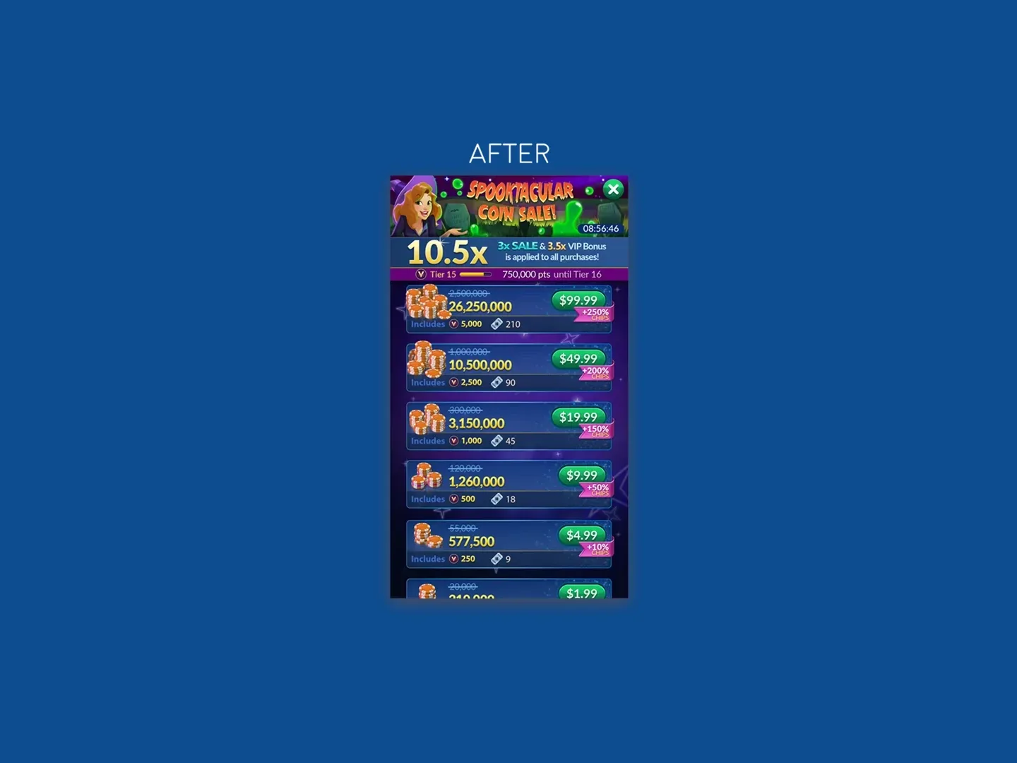
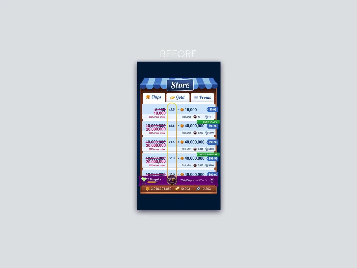
What I did
- Ran a competitive analysis and used customer feedback and product metrics to ground the design.
- Worked with product managers and engineers to build the redesigned store across platforms.
- Built an interactive prototype and ran in-person user research to find usability issues.
- Owned the UI specifications, documentation and final production of all designs and assets.
Competitive analysis
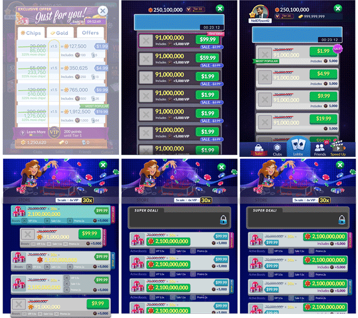
I studied the top-grossing competitors, including apps outside the casino space, to see what they do well and what they do poorly. It also helped me make the case for my decisions with stakeholders.
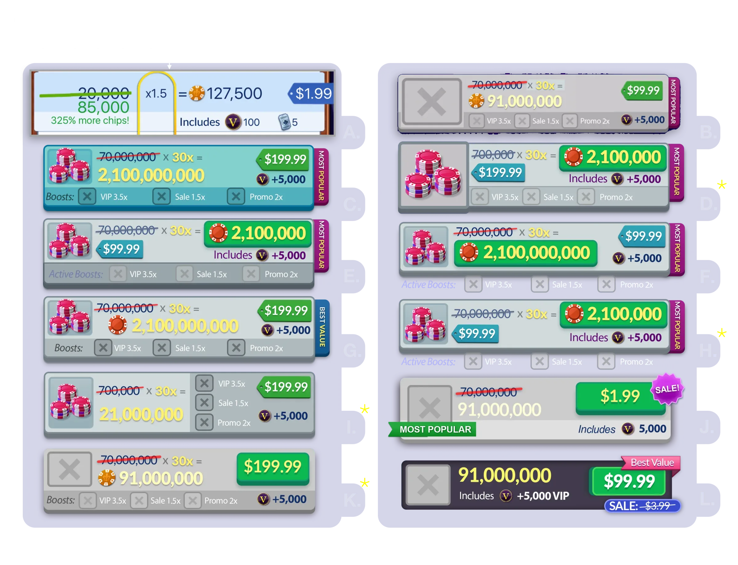
Iterating
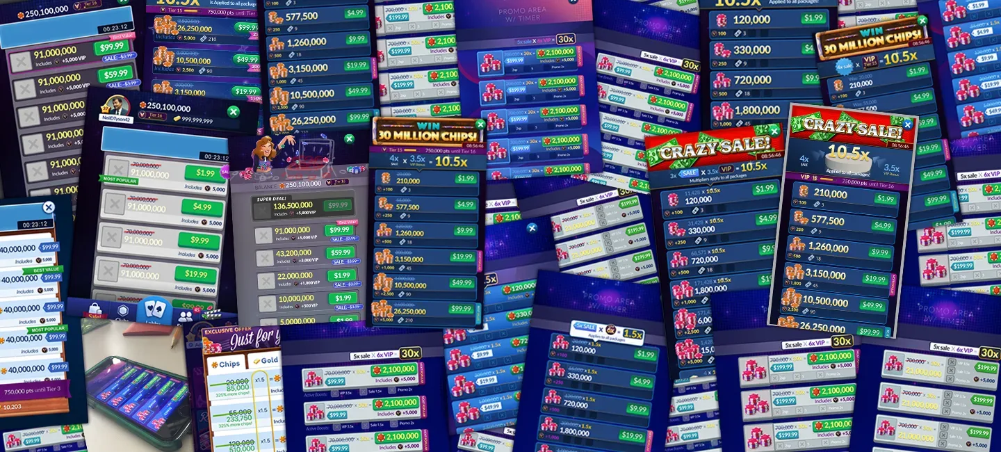
I used the competitive analysis to explore layouts and flows for the new store, and presented many iterations to key stakeholders until we found the best layouts to build as playable prototypes.
User research
I built an interactive prototype, and we used it for direct interviews with players at our research lab in Seattle to understand what they prioritize when buying. Most players were happy with the new store, and their feedback shaped several more rounds of iteration.
From approval to launch
- Engineering costing. As the design neared final approval, engineering ran a cost analysis to make sure it wasn't too expensive to build.
- Production. Art tasks such as effects animation and asset production were split across the art team. I worked closely with marketing, effects animators and illustrators to make sure it shipped polished and on time.
- Phased launch. Only some players saw the new store at first. Once the major bugs were fixed, it launched worldwide.
- After launch. We kept gathering data on what worked and what didn't, to keep improving revenue and the player experience.
Results
- The new store brought in 38.4% more revenue than the previous design.
- Customer service tickets went down.
- Players received it well: the clearer layout made buying chips easier and more delightful.